
The CRE industry is significantly underutilizing their own property-level data. That’s a bold statement, I know. And what’s really crazy is that you can get real estate data for free, specifically by mining your own data. My goal with this post is to demonstrate this fact by exploring a subset of property management software data. We’ll take a look at drive time and distance from apartment residents to their employers. Our end goal will be to predict the estimated drive time and distance to an employer that a prospective resident would be willing to accept. Get ready for part 2 of 4 steps to build a predictive model for apartment to employer drive times! By the end of this post, you will learn how you can get real estate data for free.
Why should we care about drive times and distance?
1. Most employers still expect their employees to come into the office with some regularity.
2. If you’re an asset or property manager, you may be thinking,
“I can’t change drive time from my apartments to key employers so this doesn’t matter to me.”
- Uninformed Asset or Property Manager
Instead, you should be thinking,
“Are my property’s amenities and features optimized to attract the types of residents I want?”
- Crazy Smart Asset or Property Manager
I am imagining a wave of virtual head nods through my monitor.
3. If you’re on an acquisitions team, you may be thinking,
“Why do I care about prospects on properties we already own?”
- Uninformed Acquisitions Lead
Instead, you should be thinking,
“Look at all this FREE data we already have on the types of renters and properties commensurate with our typical ownership strategy! I can’t wait to see what I learn about drive times as they relate to the types of prospective residents.”
- Crazy Smart Acquisitions Lead
I can see the fist-pumps from here!
On the edge of your seat yet? I know I am.
First, let’s talk about the data. When a prospective resident applies to lease a unit at an apartment building, property management software captures the information necessary to quantify drive time and distance. Other information is also captured at this time, such as gender, income, and birthdate. I’ll write about how I pulled this data and then wrote a Python script to pull lat/lng and routes from the MapBox API in another part of this series. Suffice it to say, I started with address data, and now I have route data from apartment to employer in distance (miles) and duration (minutes).
For purposes of this analysis, I used a subset of anonymized data from markets where driving, and not walking or public transit, is the norm. As this series is for explanatory purposes, the dataset is relatively small at approximately 2k records. Neither I nor CRExchange recommend that you draw conclusions about drive times to work from apartments using this data. Instead, we recommend that you apply this same methodology to your own dataset.
There’s an age-old joke that 80% of a data analyst or data scientist’s time is spent cleaning the data… and that is 100% true in this scenario. I’m using a subset of anonymized property management software data and did an excruciating amount of cleanup. As an aside, when we build reports for clients, we typically include a confidence scale for messy data. Something like this:
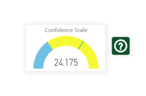
Unless the data is above the lime green mark on the gauge above, we recommend changing processes to obtain cleaner source data. We can only massage the data so much! It’s always better to change the process to fix the data than to clean it on the back-end. However, for purposes of building a predictive model, I had to get this in decent shape. A little extra elbow grease is the price you will pay so you can get real estate data for free.
Once we have the data and it’s (decently) clean, then the fun begins. We start exploring.

I’m old school when it comes to my first chart of choice: the line chart. Power BI has a feature where you can create “small multiples” by adding a categorical variable to a line chart and see each of those categories mapped out. This is hugely more efficient than CTRL+C and then CTRL+V to duplicate each chart, change the variable, rename title, etc.
Drive Time (Minutes) to Work by Age Range
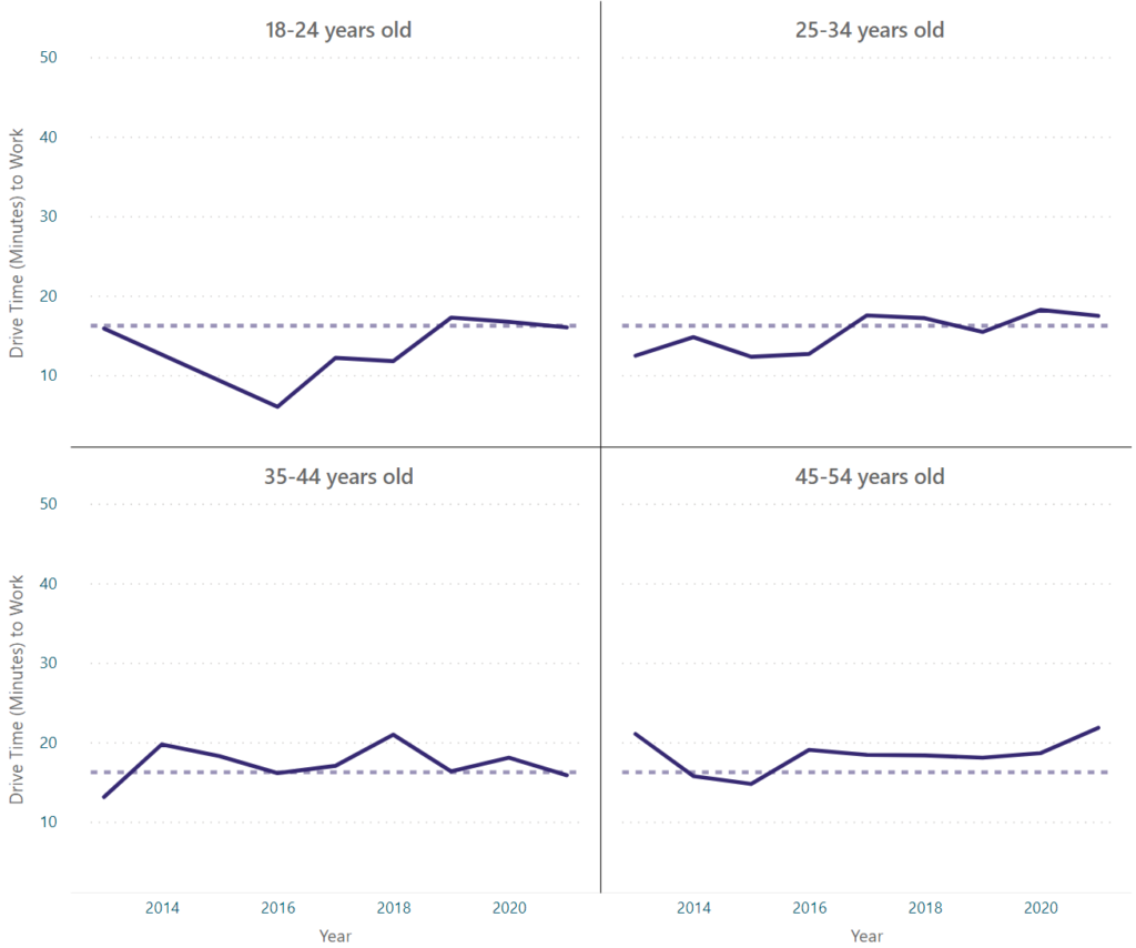
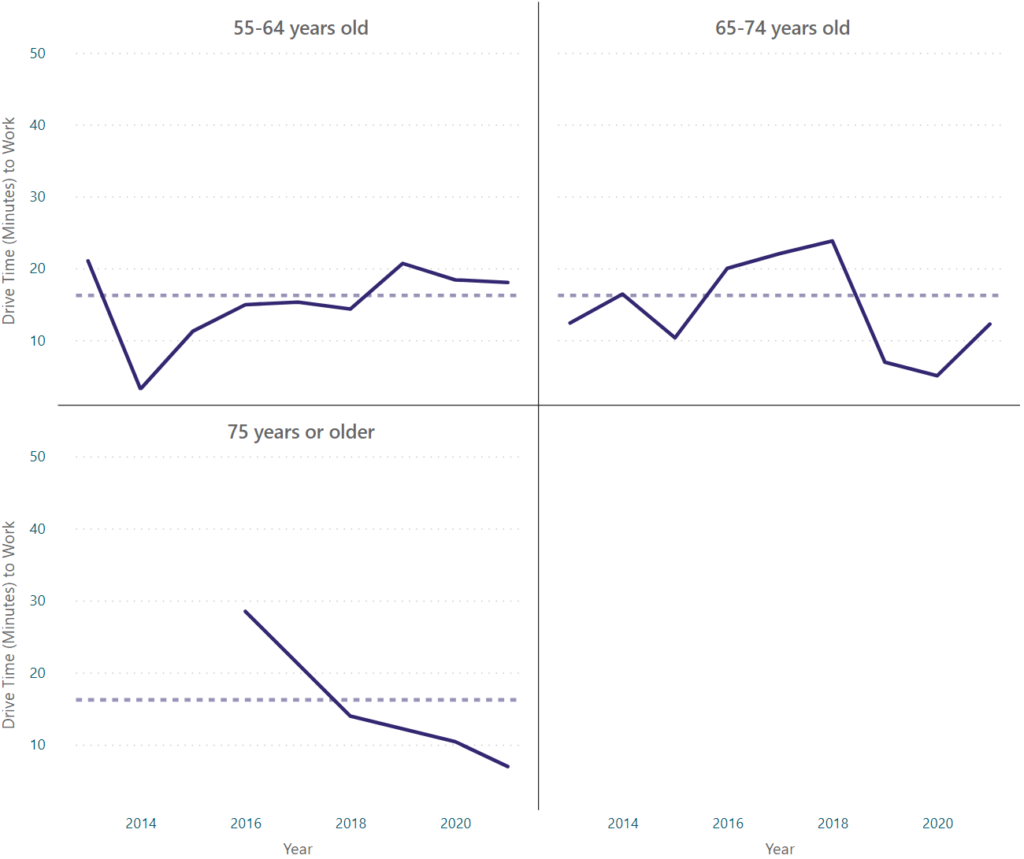
The median drive time from apartment to employer is approximately 16.88 minutes. As you can see, there are definitely age groups that typically fall above the median, such as 45-54 year-olds and 35-44 year-olds, and age groups that typically fall below the median, such as 18-24 year-olds. The other age groups demonstrated more variability or closely tracked the median (i.e. 25-34 year-olds).
Using this same technique, I also looked at driving distance and annual income. Without foreshadowing too much, I already know that driving distance and duration are tightly correlated for this particular subset of data, so we’ll focus the rest of our visuals on duration. The median distance from apartments to employers in this dataset is 9.11 miles.
Drive Distance (Miles) to Work by Income Level

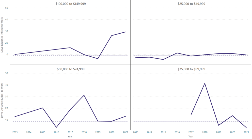
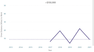
Similarly, we see certain sub-categories of income typically having longer distances to commute, such as those making between $100k-$150k. Most groups generally track the median, while others such as those making $50k-$75k, $75k-$100k, and $150k+ are highly variable over time.
Next, we’ll dive into my current favorite visual – the radar chart. Let’s take a look at that same age and income group data again. I promise that we’ll move on to more demographic data shortly!
Drive Time (Minutes) to Work by Age Range

The outermost rung in the radar chart about is 18 minutes with each rung decreasing at approximately 3.6 minute intervals.
Drive Time (Minutes) to Work by Income Level
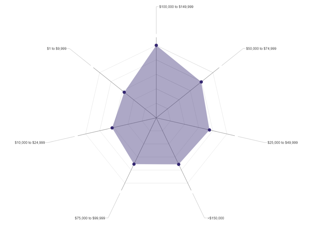
The outermost rung in the radar chart about is 25 minutes with each rung decreasing at 5 minute intervals.
Without the time component, you can more clearly see how these groups relate to each other. The 45-54 year-old age cohort tends to be fine with long commutes, whereas the 75+ age group (why aren’t they retired?!) tends to prefer shorter commutes. On the income side, those making between $100k-$150k drive longer to work, whereas those making <$10k (presumably students) drive the least to work.
Alright, I promised we’d explore some other categorical variables. Let’s take a look at the gender data available. If you know me at all, you know that I’m a huge fan of box-and-whisker plots. What better visual for a statistical summary of a dataset? (If you disagree, let me know by sending us message!) This is a violin chart, which includes a box-and-whisker plot. The shaded area behind the box-and-whisker plot helps to explain the density of the data in a more understandable visual form.


That’s right. Ladies generally like to get from Point A to Point B faster while men would rather be “Sunday drivers”*. Moving on.
*Note that at the time of this writing, property management software does not offer non-binary or other gender classification.
Now, we can start exploring how some of these variables relate to each other. And I love a good heatmap.
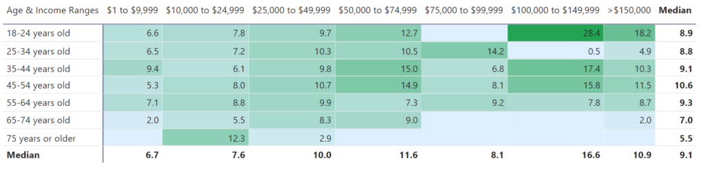
My first reaction to this was literally, “What the heck did that 22 year-old do to make $100k per year right out of college?” I briefly considered re-evaluating my life choices… and quickly decided against it. I love this stuff too much to do anything else. Seriously though, you can see that 18-24 year-olds making $100k-$150k per year have the longest commutes. The 25-34 year-olds making that same amount prefer the shortest commutes.
Lastly, before we can start building the model, we need to understand in detail the composition of our dataset. A good old-fashioned bar chart does the trick.
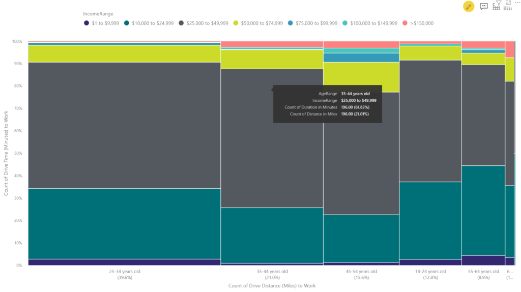
WHAT?! That’s right. Not your average bar chart here. The Marimekko chart is an awesome way to visualize categorical variables alongside numerical values. I wouldn’t recommend more than 4 variables total; the visual takes enough studying as-is. What the Marimekko chart enables you to see is the significance of variables as they relate to each other. For example, you can tell that we have the most data on the $25k-$50k in income cohort and the 25-34 year-old cohort. Now specifically within each of those cohorts, you can dive another level deeper and see how they relate in proportion to one another. Cool, right? Bet you didn’t know that all this was included when I said that you can get real estate data for free.
Well, that’s more than enough exploratory data analysis for today. We will certainly need to do more before building the model.
In future parts of this series, I will:
- walk through how I pulled the lat/lng and route data,
- do more exploratory data analysis and manipulation in order to
- build the predictive model.
Until next time! I hope you enjoyed learning about how you can get real estate data for free.
Shameless plug *ALERT*: If you’re interested in learning how we can help you access and understand your property-level data, reach out at CRExchange.io/contact.